Small Spaces
White paint does not make a small room bigger
The advice is repeated so often it has stopped being examined. What white does is reflect more light, and what makes a room feel larger is something else entirely.
There is a settled way of talking about colour in small rooms. It is worth asking how much of it survives contact with the detail.
The argument in brief
- Pale walls reflect more light but also make the boundaries of the room more visible.
- A dark room with indistinct corners can read as larger than a bright one with sharp edges.
- Uniform colour across walls, woodwork and ceiling removes the lines that measure a space.
What white actually does
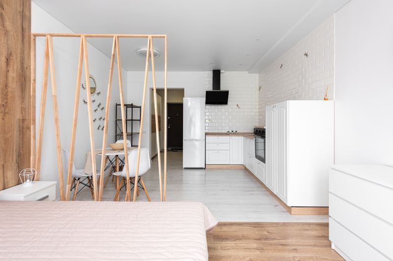
A pale surface reflects a high proportion of the light that reaches it, so a white room is brighter for a given amount of light. Brightness and spaciousness are different perceptions, and a small white room is very often simply a small bright room. White also shows every edge clearly, so the corners, the skirting and the door frame all announce exactly where the room ends.
In a room with little daylight, white walls can look grey and dead rather than fresh, because they reflect whatever they are given. None of this means white is wrong, only that it is a decision about light rather than a solution to size.
Why dark rooms can read as larger
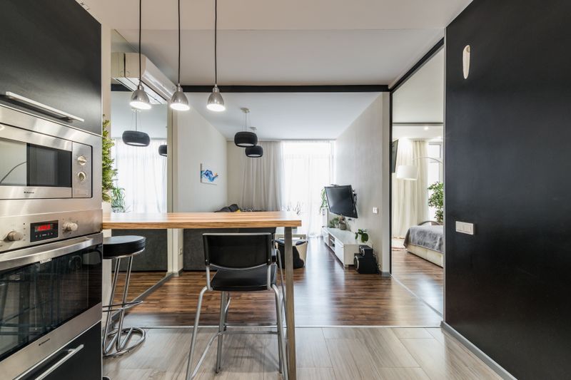
When walls are dark, the corners of a room become indistinct, and the eye stops being able to locate the boundary precisely. A space whose edges cannot be read has no obvious dimensions, which is why a dark small room can feel enveloping rather than cramped.
Live with it a while and the effect depends on committing: a dark wall with white woodwork reinstates every line the dark colour was hiding. Dark rooms need their light sources handled carefully, because there is little reflected light to fill shadows. This approach suits rooms used mainly in the evening, and it works less well for a room that has to feel workable at midday.
The lines that measure a room
A contrasting skirting, architrave and picture rail draw a diagram of the room and tell the eye exactly how big it is. Painting woodwork the same colour as the walls removes those lines, and the surfaces read as one continuous plane. Continuing the wall colour onto the ceiling does the same thing vertically and is particularly effective in a low room.
A strong contrast at the ceiling line acts like a lid, which can be desirable in a very tall room and is rarely helpful in a small one. Where a room has awkward angles or many doors, a single colour over everything is usually the calmest possible answer.
Sheen, texture and reflection
Matt finishes absorb light and hide unevenness, while sheen reflects the light source and highlights every ripple in the plaster. A slightly sheened wall bounces more light into a dark room, at the cost of showing its imperfections.
Textured surfaces catch light at an angle and create their own micro-shadows, which adds depth but reduces reflected brightness. The finish also determines washability, which matters more in small rooms where walls are brushed past constantly.
Choosing sheen for the traffic and colour for the light gives a better result than deciding both from a colour card.
Where colour goes in a small home
Small rooms that connect directly to each other benefit from a limited palette, because the eye sees several rooms at once through open doors. A completely different strong colour in each room of a flat draws attention to how quickly one room ends and the next begins.
The quieter point is that hallways and lobbies are often the right place for the darkest colour, since they are transitional and make adjoining rooms feel brighter by contrast. Using the same floor finish throughout is a stronger continuity device than wall colour, because the floor is the largest continuous surface. The through-view from the front door is worth designing deliberately, since it is the sightline that reads as the depth of the home.
Budgets and buildings differ, and old buildings differ most.
Testing in the room you have
Any colour must be judged in the light of the actual room, since a north-facing small room and a top-floor one behave completely differently. Large painted boards moved around the room over several days show how a colour behaves at every hour it is used.
Looking at the colour with the door open, alongside the adjoining room, catches clashes that a single-room test misses. Paint is the cheapest change in a house, which is a good reason to take the risk that other decisions cannot afford. If a colour turns out wrong, the cost of correcting it is a weekend, which is not true of any other surface in the room.
The takeaway
Choose pale for light and dark for depth, and either way take the colour over the woodwork so the room loses its outline.
The best rooms look like a decision, not a purchase.
Questions readers ask
Can a small room take a dark colour?
Often very well, particularly one used in the evening. The effect depends on carrying the colour onto the woodwork so the edges of the room become indistinct.
Should the ceiling always be white?
No. A ceiling in the wall colour removes the line at the top of the wall, which usually helps in a low room. A white ceiling emphasises exactly where the wall stops.